Imaginative new logos from Pres, Bray
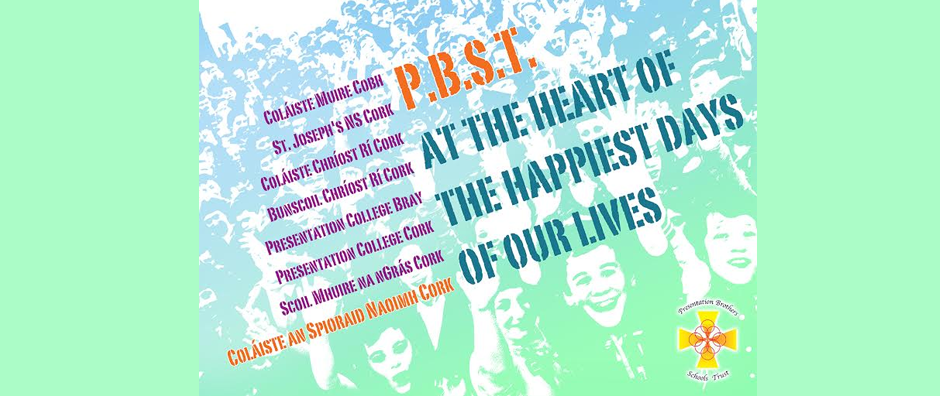
Clifton Rooney, art teacher at Presentation College, Bray has designed some very imaginative new logos to explore the values that underpin PBST schools. Clinton has given permission to schools to use these logos should they wish to do so. Clinton explains the thinking behinds the overall design as follows:
The graphic of a spinning or spiraling element of matter attempts to represent the spirit of what we are; the space within is that which cannot be defined – the blank canvas presented to each of us each year to define our years’ actions. The orange and red trail of that matter contains and protects that blank/indefinable space and indeed us by extension. It is noteworthy that the colour palette of the PBST logo is defining the colour palette of the FCCJ logo. The graphic is suggestive of the concept of physical matter and mass and the conundrum posed by the
absence of significant body in matter but its mere suggestion by spinning electrons and charges. This reminds me of the difficulty posed in defining the presentation spirit- it’s there, but what is it?
The ‘f’ is reminiscent of a cross symbolizing faith. That the orange trail makes the arms of the cross is significant in that it intrinsically binds the concept of the spirit of Pres with the Faith underpinning it. The ‘j’ is completed by the dot spinning through the image. The dot moves beyond the ‘j’ to suggest the energy within the community and indeed the continual need to evolve in time – moving forward. This movement is again suggested by the italicized text.
Please click on the links to access the logos:
